


This work was done, in part, to fulfill the requirements of CMSC 838S (Information Visualization) at the University of Maryland, College Park.
The Onion Routing project was initiated two years ago with the goal of protecting general purpose Internet traffic against traffic analysis. While the theoretical model is not as strong as the proposed PipeNet model, we have argued that the model is strong enough to repel all but the most sophisticated attacks (that and the fact that PipeNet cannot be built). To back up these claims we have begun detailed analysis of a Testbed Onion Routing Network. This network has been modified to record statistics on data flowing through each network node, but not to record the actual data flowing through the node. It is extremely important that this last claim be true or we would rapidly see little, if any, usage of the network.
The task we are attempting to perform here is finding correlations (both volume and timing signatures) within the Testbed Onion Routing Network.
While a small body of literature exist in the area of traffic analysis, we were unable to find any unclassified work in the area of visualizing traffic analysis. In the past, traffic analysis attacks were mounted using statistical analysis. While statistical methods are effective in trained hands, most people are unable to grasp the real meaning of what a .7 correlation means.
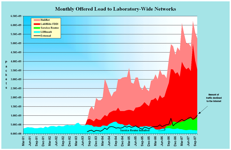
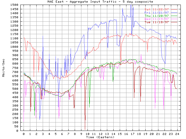
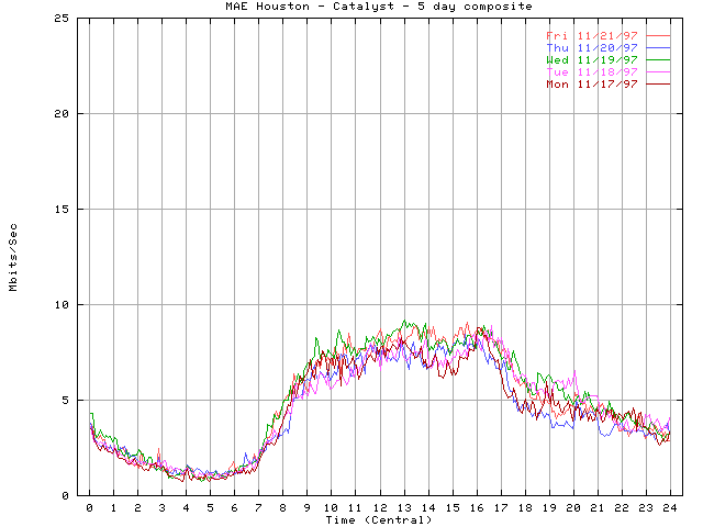
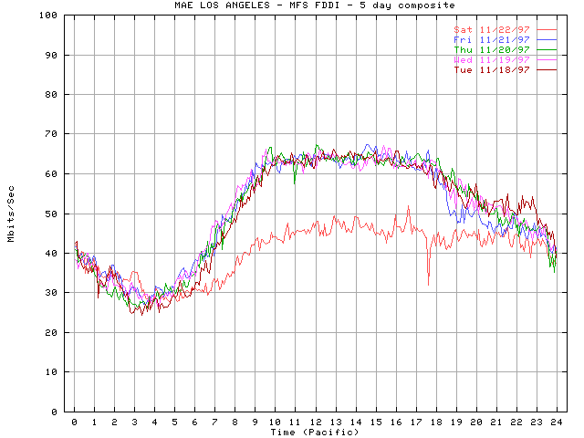
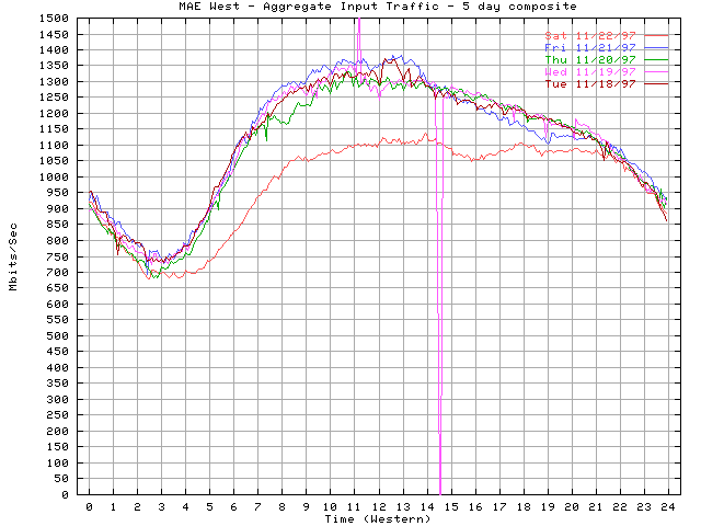
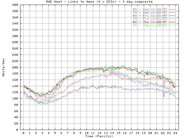
Given the lack of previous work in the area, we looked for other areas of computer network visualization. Included below are some examples of traffic per unit time (the first plot is network load at the Argonne National Laboratory over a period of several years, and the later plots are network load at MFS's MAE Internet interconnect points).
 (Postscript [2MB] or PDF [70KB])
 (Postscript [1.5MB] or PDF [19KB])
 (Postscript [1.5MB] or PDF [15KB])
 (Postscript [1.5MB] or PDF [16KB])
 (Postscript [1.5MB] or PDF [17KB])
 (Postscript [1.5MBK] or PDF [17KB])
While these graphs are meaningful in their own right, the time resolution, and the ability to directly correlate several data sources is lacking. For a better understanding on what we need to look for in a graph, we need to understand the data first.
The modified network nodes record the number of DATA cells (cells) processed during each MIX cycle, the number of Anonymous Connections (vcs) represented by the DATA cells being mixed, and the time of the MIX operation. Data records are of the form:
	Mixed time=878850679 vcs=1 cells=6 (thread 6)
	Mixed time=878850680 vcs=1 cells=1 (thread 6)
	Mixed time=878850680 vcs=1 cells=1 (thread 6)
	Mixed time=878850680 vcs=1 cells=1 (thread 6)
	Mixed time=878850680 vcs=1 cells=1 (thread 6)
	Mixed time=878850680 vcs=1 cells=2 (thread 6)
	Mixed time=878850680 vcs=1 cells=63 (thread 6)
	Mixed time=878850680 vcs=1 cells=1 (thread 6)
	Mixed time=878850680 vcs=2 cells=8 (thread 6)
	Mixed time=878850684 vcs=1 cells=7 (thread 6)
	Mixed time=878850685 vcs=1 cells=7 (thread 6)
	Mixed time=878850685 vcs=1 cells=7 (thread 6)
	Mixed time=878850687 vcs=1 cells=1 (thread 6)
	Mixed time=878850687 vcs=1 cells=1 (thread 6)
	Mixed time=878850687 vcs=1 cells=5 (thread 6)
	Mixed time=878850687 vcs=1 cells=1 (thread 6)
	Mixed time=878850687 vcs=1 cells=1 (thread 6)
	Mixed time=878850687 vcs=2 cells=2 (thread 6)
	Mixed time=878850687 vcs=2 cells=10 (thread 6)
	Mixed time=878850687 vcs=1 cells=1 (thread 6)
	Mixed time=878850687 vcs=1 cells=1 (thread 6)
	Mixed time=878850688 vcs=1 cells=2 (thread 6)
	Mixed time=878850688 vcs=1 cells=1 (thread 6)
	Mixed time=878850688 vcs=1 cells=5 (thread 6)
	Mixed time=878850688 vcs=1 cells=4 (thread 6)
	Mixed time=878850688 vcs=1 cells=61 (thread 6)
	Mixed time=878850688 vcs=1 cells=2 (thread 6)
	Mixed time=878850688 vcs=3 cells=12 (thread 6)
	Mixed time=878850688 vcs=1 cells=55 (thread 6)
	Mixed time=878850688 vcs=1 cells=32 (thread 6)
	Mixed time=878850688 vcs=1 cells=5 (thread 6)
	Mixed time=878850688 vcs=2 cells=32 (thread 6)
	Mixed time=878850689 vcs=1 cells=1 (thread 6)
	Mixed time=878850689 vcs=1 cells=1 (thread 6)
	Mixed time=878850689 vcs=1 cells=1 (thread 6)
	Mixed time=878850690 vcs=1 cells=66 (thread 6)
	Mixed time=878850690 vcs=1 cells=3 (thread 6)
	Mixed time=878850690 vcs=2 cells=72 (thread 6)
	Mixed time=878850717 vcs=1 cells=7 (thread 6)
	Mixed time=878850718 vcs=1 cells=1 (thread 6)
	Mixed time=878850718 vcs=1 cells=1 (thread 6)
	Mixed time=878850718 vcs=1 cells=5 (thread 6)
	Mixed time=878850719 vcs=1 cells=1 (thread 6)
	Mixed time=878850719 vcs=1 cells=1 (thread 6)
	Mixed time=878850719 vcs=1 cells=1 (thread 6)
	Mixed time=878850719 vcs=1 cells=1 (thread 6)
	Mixed time=878850719 vcs=1 cells=36 (thread 6)
	Mixed time=878850719 vcs=1 cells=29 (thread 6)
	Mixed time=878850719 vcs=1 cells=21 (thread 6)
	Mixed time=878850719 vcs=2 cells=52 (thread 6)
	Mixed time=878850723 vcs=1 cells=7 (thread 6)
In this form, the data is not very usable. A number of scripts were generated to reduce the data into a more usable format for both the statistical and visualization tools. Initial data-sets were generated with run times of 1 (20,000 data points), 12 (350,000 data points), and 30 (1,400,000 data points) days of traffic.
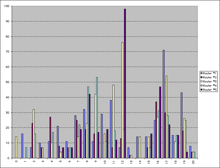
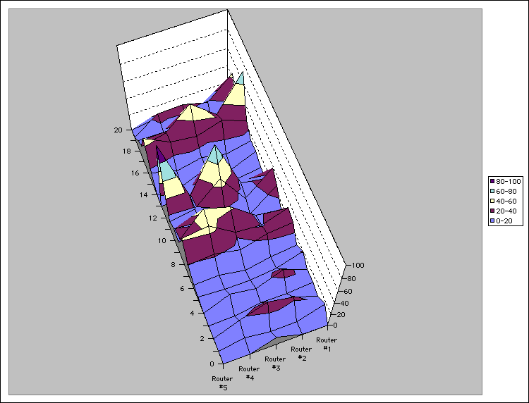
A smaller data-set is included below and used in some of the later (Excel) graphs. This data-set contains 21 one-second time intervals and the number of DATA cells processed at each Onion Router in our five node network at that time. This is real data without any form of link padding.
| Time | Router #1 | Router #2 | Router #3 | Router #4 | Router #5 | 0 | 0 | 0 | 14 | 0 | 0 | 1 | 16 | 0 | 0 | 7 | 0 | 2 | 7 | 23 | 32 | 16 | 0 | 3 | 10 | 7 | 7 | 0 | 0 | 4 | 11 | 27 | 10 | 17 | 0 | 5 | 21 | 8 | 4 | 4 | 7 | 6 | 11 | 7 | 0 | 7 | 7 | 7 | 28 | 25 | 14 | 22 | 19 | 8 | 32 | 19 | 23 | 47 | 42 | 9 | 11 | 16 | 42 | 53 | 17 | 10 | 29 | 0 | 16 | 11 | 19 | 11 | 38 | 7 | 48 | 18 | 12 | 12 | 7 | 13 | 76 | 19 | 98 | 13 | 7 | 2 | 2 | 0 | 0 | 14 | 14 | 0 | 14 | 0 | 0 | 15 | 14 | 7 | 14 | 7 | 16 | 16 | 25 | 37 | 27 | 31 | 47 | 17 | 71 | 30 | 54 | 28 | 22 | 18 | 15 | 0 | 11 | 15 | 15 | 19 | 43 | 18 | 26 | 25 | 4 | 20 | 8 | 4 | 4 | 4 | 0 |
Given this data we can compute the correlation table:
| Router #1 | Router #2 | Router #3 | Router #4 | Router #5 | |
| Router #1 | 1 | 0.43781177 | 0.37258342 | 0.41786256 | 0.11521714 |
| Router #2 | 0.43781177 | 1 | 0.41254375 | 0.63427175 | 0.32739694 |
| Router #3 | 0.37258342 | 0.41254375 | 1 | 0.53632493 | 0.7001685 |
| Router #4 | 0.41786256 | 0.63427175 | 0.53632493 | 1 | 0.44152445 |
| Router #5 | 0.11521714 | 0.32739694 | 0.7001685 | 0.44152445 | 1 |
While this table is useful to statisticians, it is difficult for most people to grasp what a ".44152445" correlation really means. This is where the graphical representations really help.
We attempted to visualize the 12-day data-set with the Spotfire tool. The first attempt was on a small Pentium machine (90Mhz with 48MB of memory). It became painfully evident that Spotfire could not handle the 350,000 data points on this machine so we moved to a more powerful Dual Pentium II (2x300Mhz with 512MB of memory). This machine could barely handle the 12-day data-set and was unable to even load the 30-day data-set. While Spotfire is a wonderful tool for exploring data, it is not capable of scaling to the size of data-sets we wished to visualize.
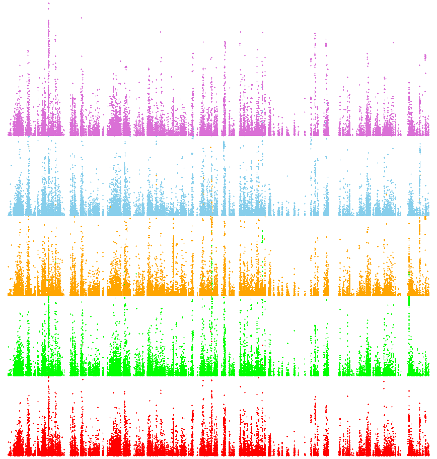
Given the disappointment of the Spotfire visualizations, we next attempted to look at the 12-day data-set with XGOBI. To handle the computational load, a number of Sun Ultra 2's (2x300Mhz with 512MB of memory) were used. A high-level view of the entire 12-day data-set gave us (the load of each Onion Router is plotted versus time):
 (Postscript [18.7MB] or PDF [4.5MB])
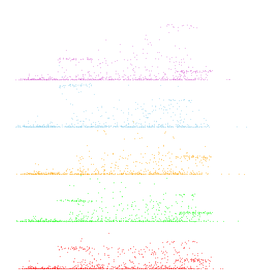
Once this data-set was rendered, it was easy to quickly burrow down and analyze smaller windows of time:
 (Postscript [19.5MB] or PDF [75KB])
As you can see in both of these plots, there are very clear correlations that exist. If the Onion Routing Network is properly hiding the information, none of these correlations must exist.
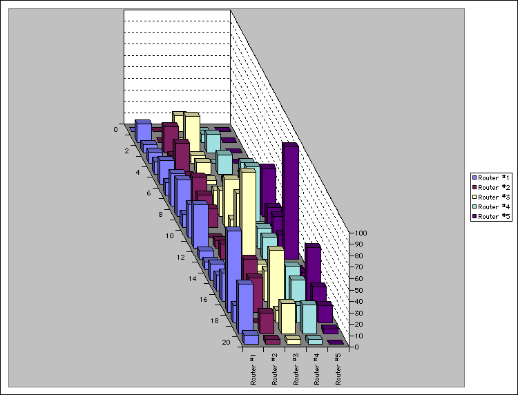
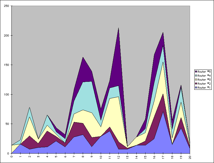
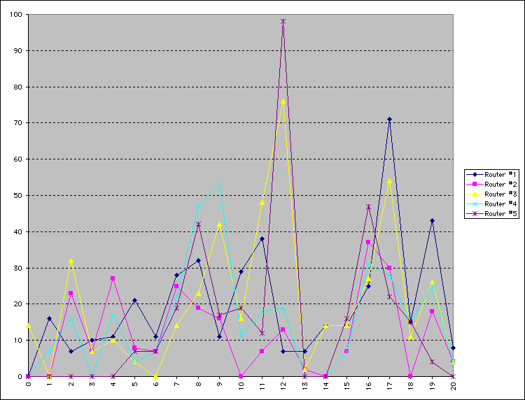
While XGOBI gives us a a good way to quickly zoom in and out on massive data-sets, it is still difficult to do close correlation analysis. Some data artifacts are immediately visible, but others require other forms of visualization to make them obvious or to track them through the network or through time. To this end, we visualized the 21-second data set in a number of different ways with excel to get a better idea of what representations worked for the task we were attempting to accomplish. Some of these visualizations clearly show the correlations between Onion Routers, while others hide or mask those correlations.
 (Postscript [2MB] or PDF [12KB])
 (Postscript [2MB] or PDF [16KB])
 (Postscript [2MB] or PDF [16KB])
 (Postscript [2MB] or PDF [18KB])
 (Postscript [2MB] or PDF [18KB])
It should now be very obvious that the Onion Routing system as it exists without link padding is still very vulnerable to traffic analysis attacks. To counteract what these visualizations show, we added link level padding to a sine wave over a 24-hour clock. We chose this form of padding to best make use of available bandwidth without wasting enormous amounts that constant padding to a high threshold would do. The idea of using a sine wave over a 24-hour clock came from looking at the MAE load data supplied by MFS (the MAE Internet interconnect points carry the bulk of all Internet traffic in the United States. As such, they are a good model of general traffic flow). By enforcing the sine padding at all nodes, we were able to completely remove the artifacts that allow data to be traced as it moves through the network, but at a large cost to bandwidth. Below is a load graph of the same five node network over a seven day period of time with full sine padding:
 (Postscript [1.2MB] or PDF [210KB])
We have already found these visualizations extremely valuable in explaining what traffic analysis is, and to show how a traffic analysis attack could be mounted in general. The specific application of these techniques to the Onion Routing problem has shown us how important link padding is to properly protect the traffic.
One of the problems with these visualizations is the fact that they
visualize the load through a node and not the load through the links
connecting nodes. While the later will be crucial to the long-term
project, the short term results of just load through nodes has
guided our efforts in a producing a quick-fix to an obvious flaw in
our implementation. Furthermore, by applying these methods to the
long-term analysis, we feel that a better curve-fitting algorithm
will be developed that minimizes wasted bandwidth yet satisfies our
security constraints.
Historical page reflecting onion-router.net as of 2005, not regularly maintained.